BeatLoop

Modern, dynamic brand and identity built to establish BeatLoop - a music practice app for dancers, made by dancers.

00

problem

BeatLoop - a product for a niche of an audience is a young start-up aiming to put their product on the map. Being a new entrant in the market, they needed a face and identity for their app. The app had to stand out from its “sporty” looking competitors while conveying its uniqueness and function. As per the brand vision, a certain visual association with its parent company - OnBeat was necessary and an additional constraint as well.

solution

We developed a visual identity that emphasised the feel and function of the product, using the most direct expression of the core feature of the app - the loop - which became the finalised form for the logo. It was positioned to resemble a the sole of a dancer’s shoe. The final logo was a simple form detailed with differing line weight and italic font that provided a sense of motion. The colour palette borrowed from OnBeat logo ensured the visual association and gave the brand a modern, cutting-edge feel.

problem

BeatLoop - a product for a niche of an audience is a young start-up aiming to put their product on the map. Being a new entrant in the market, they needed a face and identity for their app. The app had to stand out from its “sporty” looking competitors while conveying its uniqueness and function. As per the brand vision, a certain visual association with its parent company - OnBeat was necessary and an additional constraint as well.

solution

We developed a visual identity that emphasised the feel and function of the product, using the most direct expression of the core feature of the app - the loop - which became the finalised form for the logo. It was positioned to resemble a the sole of a dancer’s shoe. The final logo was a simple form detailed with differing line weight and italic font that provided a sense of motion. The colour palette borrowed from OnBeat logo ensured the visual association and gave the brand a modern, cutting-edge feel.

problem

BeatLoop - a product for a niche of an audience is a young start-up aiming to put their product on the map. Being a new entrant in the market, they needed a face and identity for their app. The app had to stand out from its “sporty” looking competitors while conveying its uniqueness and function. As per the brand vision, a certain visual association with its parent company - OnBeat was necessary and an additional constraint as well.

solution

We developed a visual identity that emphasised the feel and function of the product, using the most direct expression of the core feature of the app - the loop - which became the finalised form for the logo. It was positioned to resemble a the sole of a dancer’s shoe. The final logo was a simple form detailed with differing line weight and italic font that provided a sense of motion. The colour palette borrowed from OnBeat logo ensured the visual association and gave the brand a modern, cutting-edge feel.

problem

BeatLoop - a product for a niche of an audience is a young start-up aiming to put their product on the map. Being a new entrant in the market, they needed a face and identity for their app. The app had to stand out from its “sporty” looking competitors while conveying its uniqueness and function. As per the brand vision, a certain visual association with its parent company - OnBeat was necessary and an additional constraint as well.

solution

We developed a visual identity that emphasised the feel and function of the product, using the most direct expression of the core feature of the app - the loop - which became the finalised form for the logo. It was positioned to resemble a the sole of a dancer’s shoe. The final logo was a simple form detailed with differing line weight and italic font that provided a sense of motion. The colour palette borrowed from OnBeat logo ensured the visual association and gave the brand a modern, cutting-edge feel.

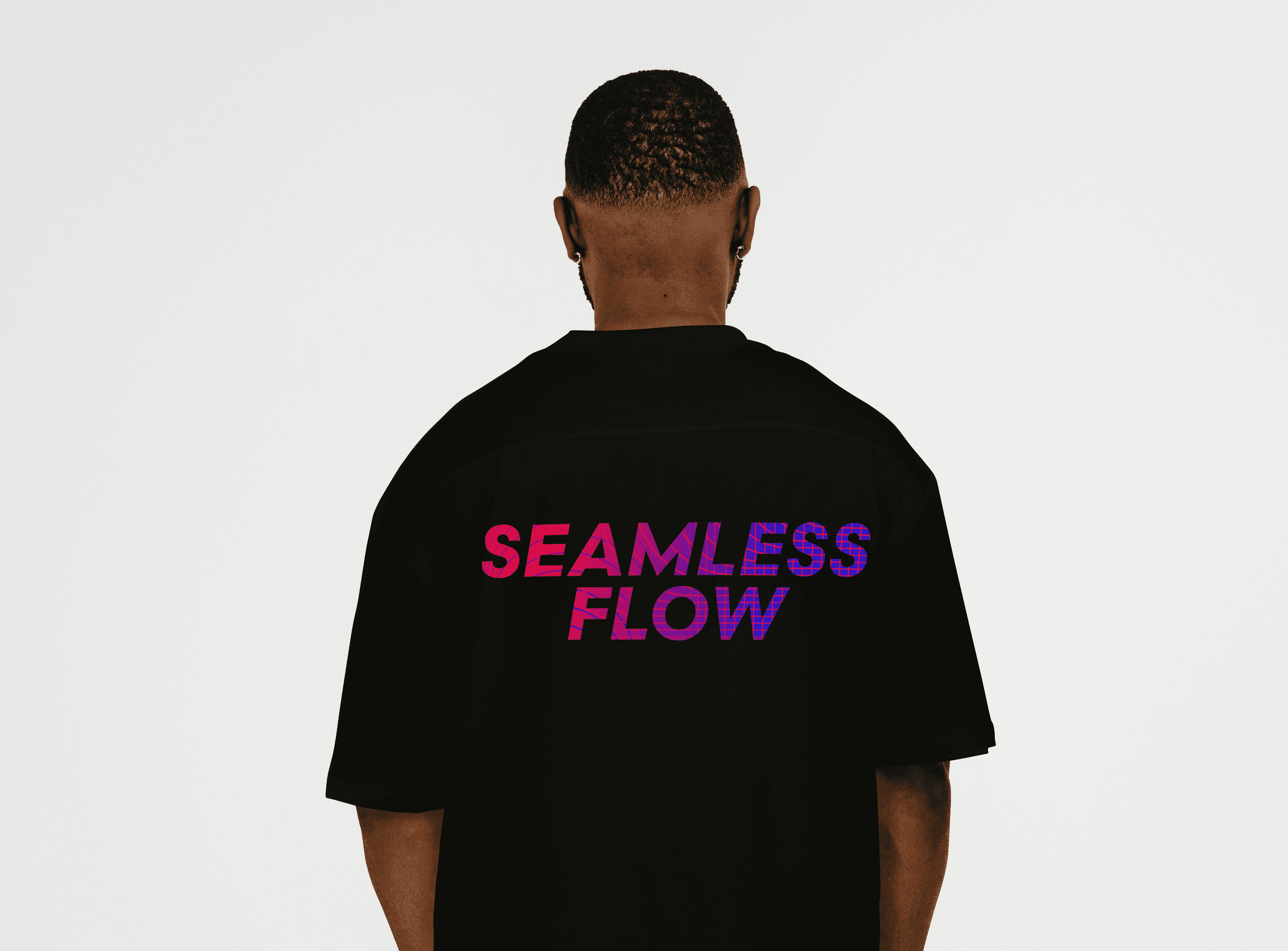
Keeping it simple was what made the idea land. It allowed the core concept to translate without much confusion and served the purpose of merging music, dance and tech. The identity extended beyond the phone screens into physical spaces and community touch-points through the launch events and various ongoing workshops. The face of the app now became recognisable amongst its potential users as well.


year

2025

timeframe

7 Months

category

Branding and Identity

01

02

03

04

05

06

07
08

09

010

011

012

013

.say hello

Always exited to work on a new project! Let's collaborate.

.say hello

Always exited to work on a new project! Let's collaborate.