Punto Cubano

A visual identity for a Berlin dance school teaching Cuban dance forms by translating the feeling of movement and fluidity of dance into a memorable and connecting visual presence.

00
problem

There was no existing branding to build on - a genuine blank page. The real challenge wasn’t the blank page itself, it was translating something physical and felt into a static visual. The logo doesn’t move, it had to imply movement instead. An additional challenge was understanding and learning more about the specific dance forms being taught and the cultural context of Cuban dance being practiced in Berlin.

solution

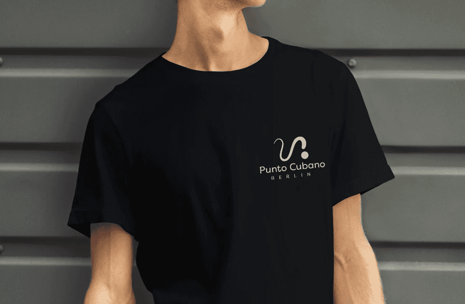
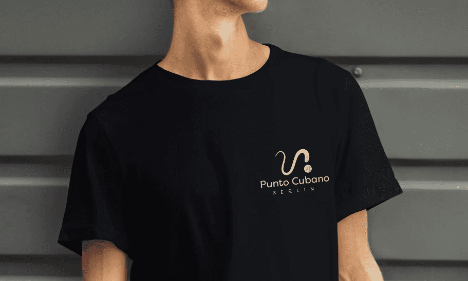
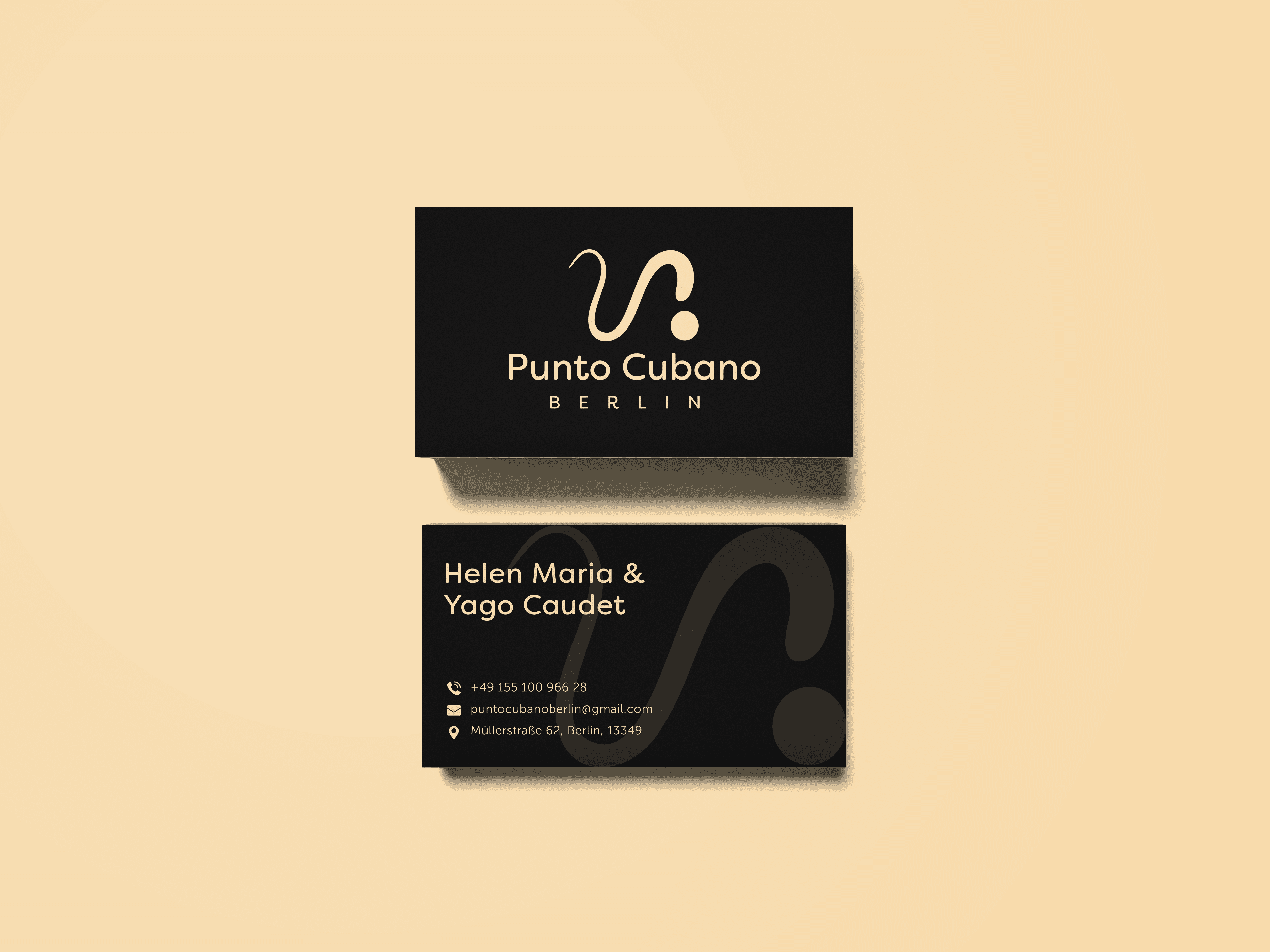
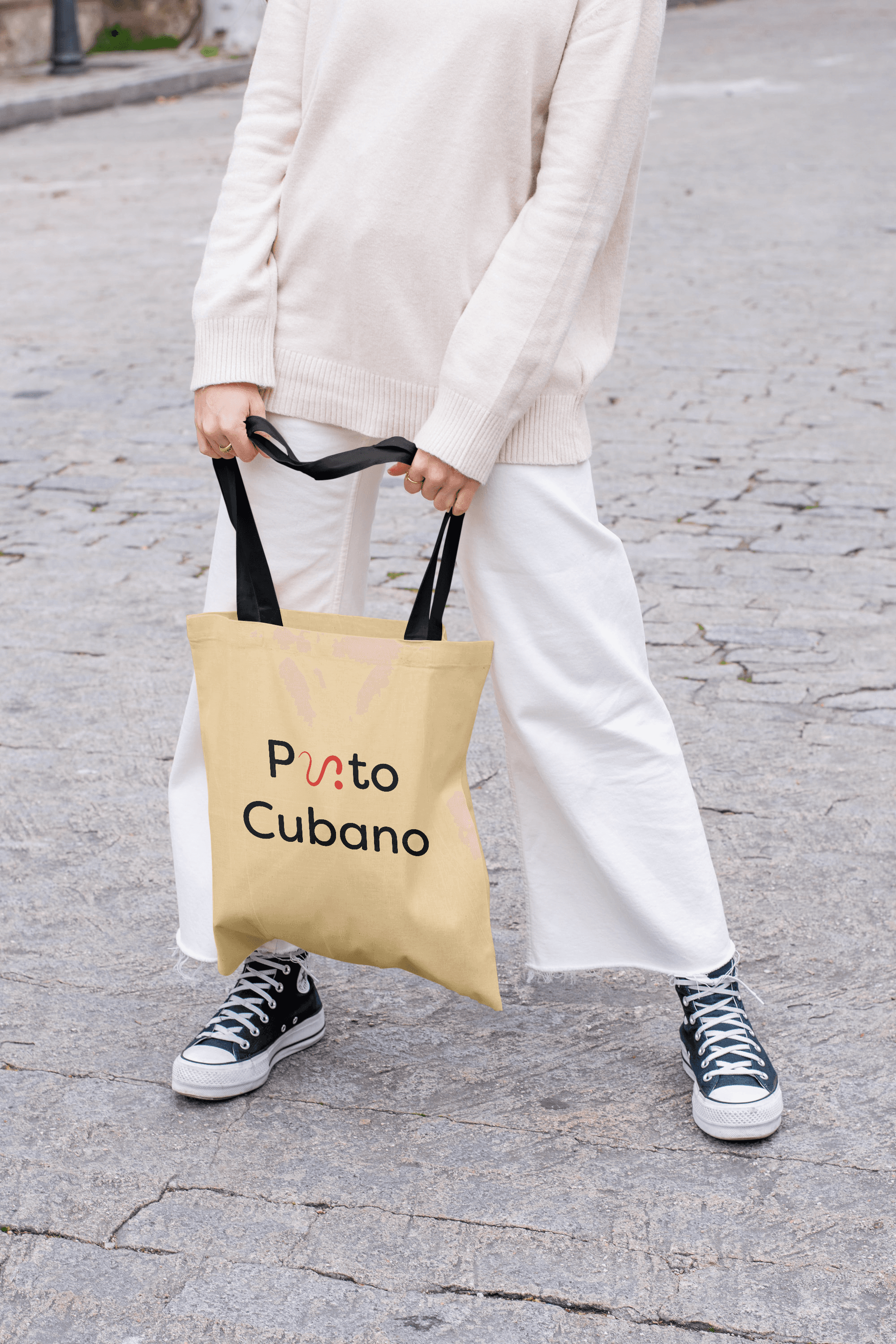
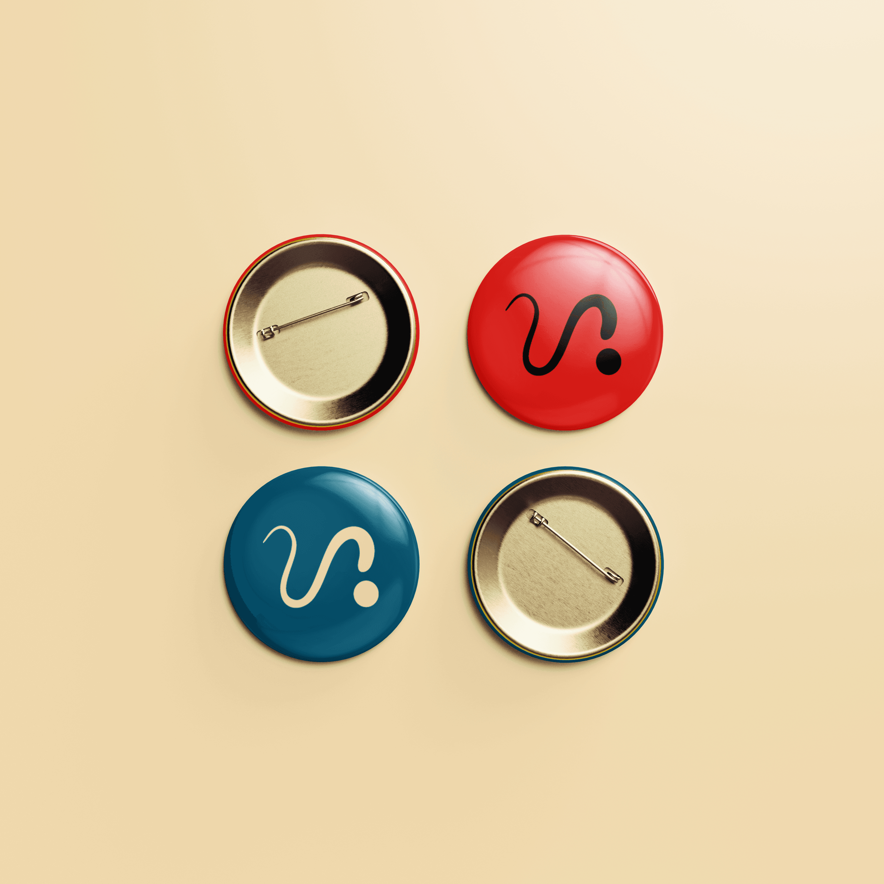
The through line across every decision was “Punto”; the idea of a single point that movement flows out from and returns to, which became the core concept for the logo. “Punto” or a dot became the main visual element that represented flow and beat through a “swish and pause” kind of visual. This visual also became the substitute for the letters “u” & “n” in the word “Punto” creating a secondary version of the logo. The colours were kept close to the Cuban palette with font pairings that read clean while hinting movement through their forms.

problem

There was no existing branding to build on - a genuine blank page. The real challenge wasn’t the blank page itself, it was translating something physical and felt into a static visual. The logo doesn’t move, it had to imply movement instead. An additional challenge was understanding and learning more about the specific dance forms being taught and the cultural context of Cuban dance being practiced in Berlin.

solution

The through line across every decision was “Punto”; the idea of a single point that movement flows out from and returns to, which became the core concept for the logo. “Punto” or a dot became the main visual element that represented flow and beat through a “swish and pause” kind of visual. This visual also became the substitute for the letters “u” & “n” in the word “Punto” creating a secondary version of the logo. The colours were kept close to the Cuban palette with font pairings that read clean while hinting movement through their forms.

problem

There was no existing branding to build on - a genuine blank page. The real challenge wasn’t the blank page itself, it was translating something physical and felt into a static visual. The logo doesn’t move, it had to imply movement instead. An additional challenge was understanding and learning more about the specific dance forms being taught and the cultural context of Cuban dance being practiced in Berlin.

solution

The through line across every decision was “Punto”; the idea of a single point that movement flows out from and returns to, which became the core concept for the logo. “Punto” or a dot became the main visual element that represented flow and beat through a “swish and pause” kind of visual. This visual also became the substitute for the letters “u” & “n” in the word “Punto” creating a secondary version of the logo. The colours were kept close to the Cuban palette with font pairings that read clean while hinting movement through their forms.

problem

There was no existing branding to build on - a genuine blank page. The real challenge wasn’t the blank page itself, it was translating something physical and felt into a static visual. The logo doesn’t move, it had to imply movement instead. An additional challenge was understanding and learning more about the specific dance forms being taught and the cultural context of Cuban dance being practiced in Berlin.

solution

The through line across every decision was “Punto”; the idea of a single point that movement flows out from and returns to, which became the core concept for the logo. “Punto” or a dot became the main visual element that represented flow and beat through a “swish and pause” kind of visual. This visual also became the substitute for the letters “u” & “n” in the word “Punto” creating a secondary version of the logo. The colours were kept close to the Cuban palette with font pairings that read clean while hinting movement through their forms.

The design translated well and felt honest to the feeling rather than being a literal illustration of dance and movement. Keeping intact the values of connection and joy experienced in the dancing, the branding insisted on the fundamental element “punto” or point important to the specific dance forms and also native to dancing in general. The identity system hence blended quite easily into multiple extensions of the dance school, connecting to the new learners.


year

2024

timeframe

3 Months

category

Branding and Identity

01
02

03

04
05

06

07
08

09

010

011

012

013
014

.say hello

Always exited to work on a new project! Let's collaborate.

.say hello

Always exited to work on a new project! Let's collaborate.