HiDesk

A corporate identity for an AI-powered digital reception, built with human-ness at its core to cut through a crowded B2B SaaS market.

00

problem

HiDesk came in with a quite generic, placeholder logo which couldn’t possibly compete in the sharp tech market. It needed a modern and clean identity to sit beside serious B2B tools. Although, it also had to appeal to its users to earn their trust to handover their front line to an AI tool. Essentially it had to move away from visual language that felt tech heavy and overdone.

solution

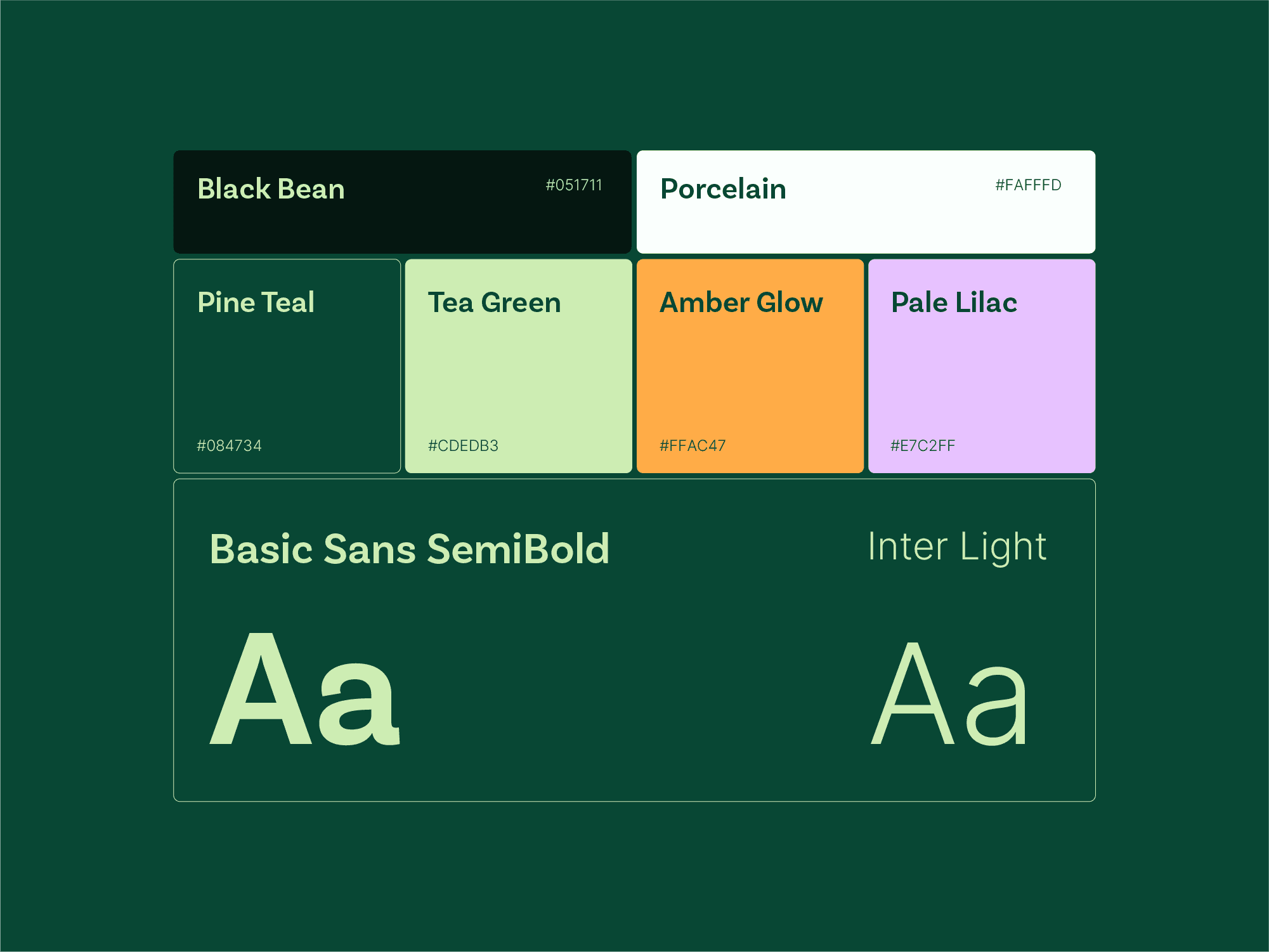
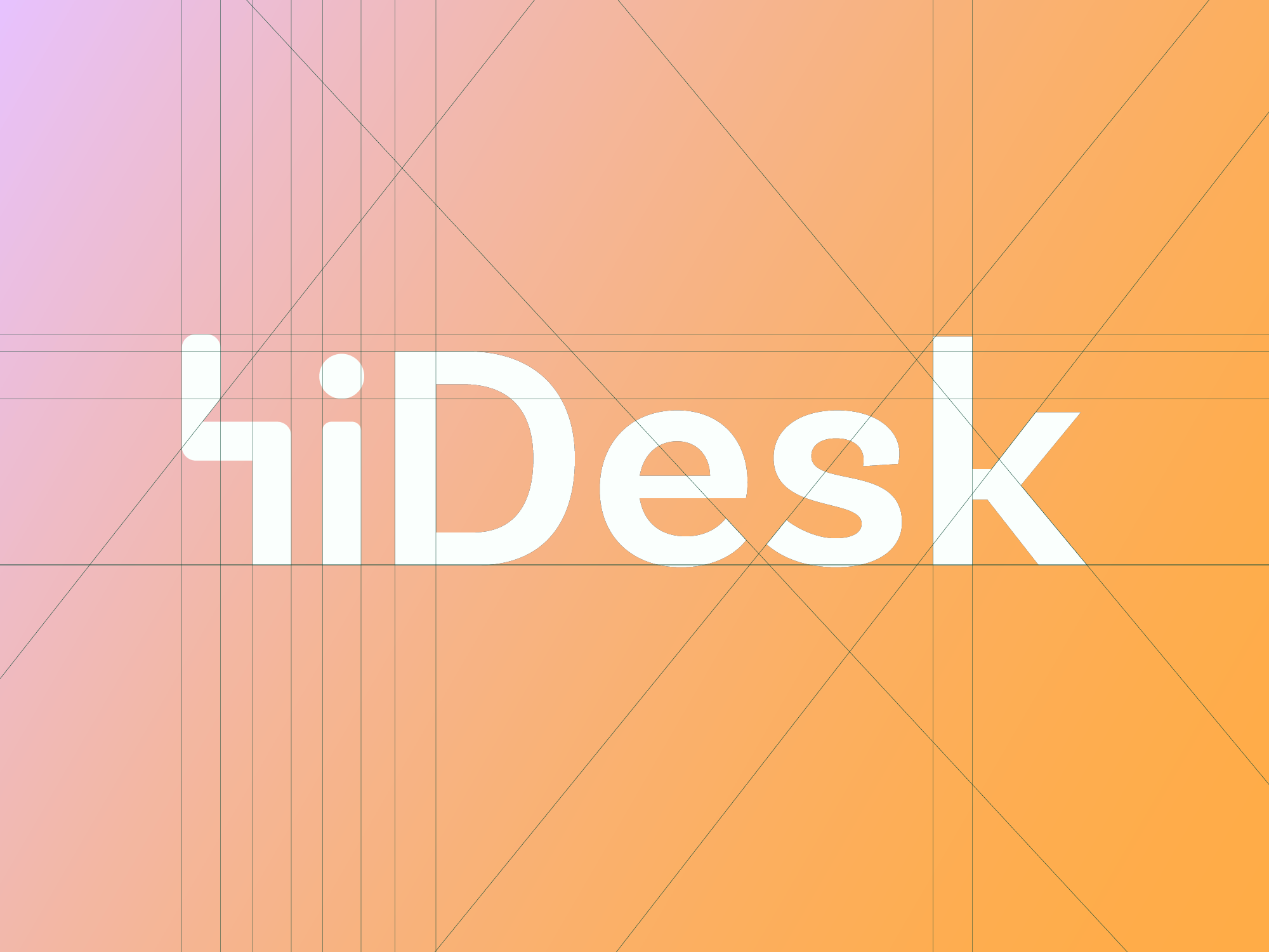
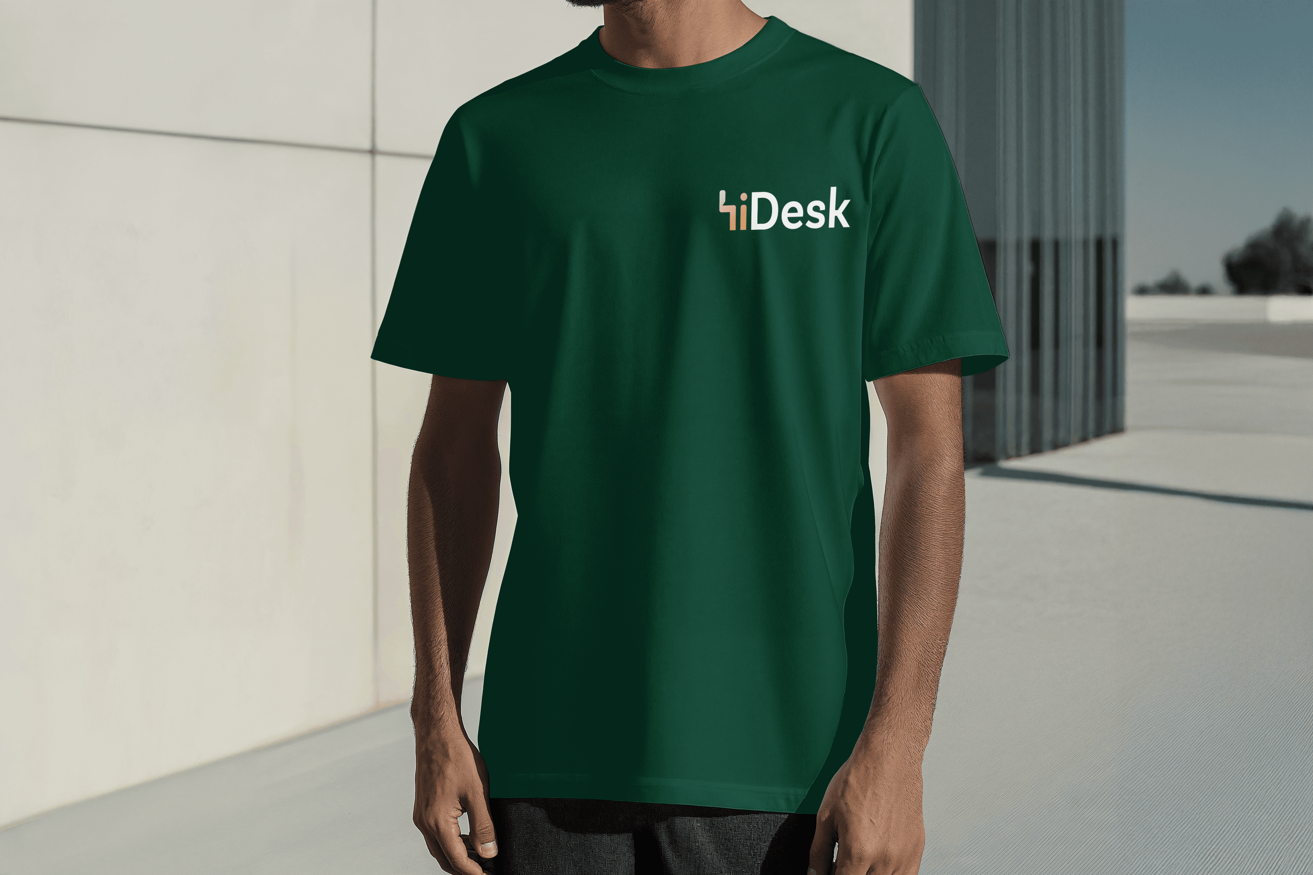
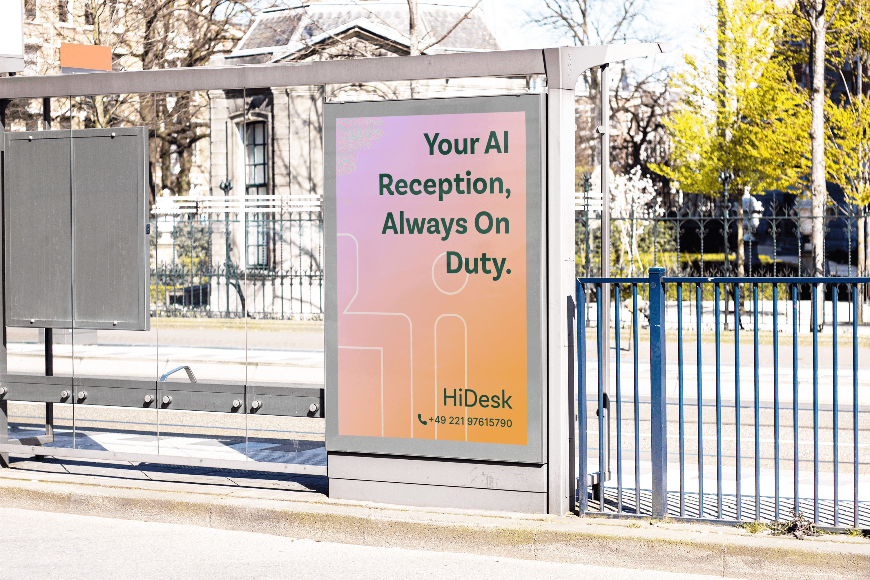
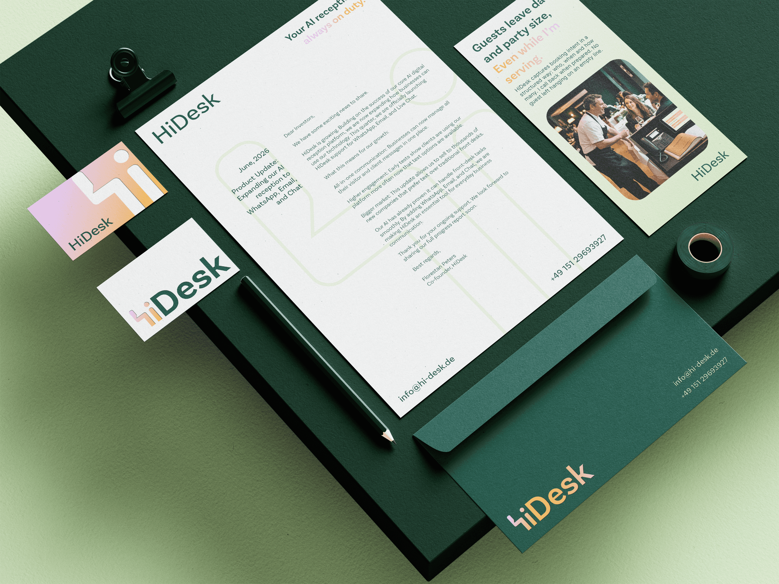
Understanding what HiDesk actually does for a small business owner shaped how it should look. Starting with a deliberate choice, the visual clichés like microphone, sound waves, phone or chat icons were avoided. The logo inspiration was drawn from the literal image of a person behind the desk, merged with the forms of alphabet ‘h’ & ‘i’. Put together with a clean and friendly font and a combination of warm and fresh pastels against deep, calm hues, and a hero illustration that made the tool’s function instantly legible.

problem

HiDesk came in with a quite generic, placeholder logo which couldn’t possibly compete in the sharp tech market. It needed a modern and clean identity to sit beside serious B2B tools. Although, it also had to appeal to its users to earn their trust to handover their front line to an AI tool. Essentially it had to move away from visual language that felt tech heavy and overdone.

solution

Understanding what HiDesk actually does for a small business owner shaped how it should look. Starting with a deliberate choice, the visual clichés like microphone, sound waves, phone or chat icons were avoided. The logo inspiration was drawn from the literal image of a person behind the desk, merged with the forms of alphabet ‘h’ & ‘i’. Put together with a clean and friendly font and a combination of warm and fresh pastels against deep, calm hues, and a hero illustration that made the tool’s function instantly legible.

problem

HiDesk came in with a quite generic, placeholder logo which couldn’t possibly compete in the sharp tech market. It needed a modern and clean identity to sit beside serious B2B tools. Although, it also had to appeal to its users to earn their trust to handover their front line to an AI tool. Essentially it had to move away from visual language that felt tech heavy and overdone.

solution

Understanding what HiDesk actually does for a small business owner shaped how it should look. Starting with a deliberate choice, the visual clichés like microphone, sound waves, phone or chat icons were avoided. The logo inspiration was drawn from the literal image of a person behind the desk, merged with the forms of alphabet ‘h’ & ‘i’. Put together with a clean and friendly font and a combination of warm and fresh pastels against deep, calm hues, and a hero illustration that made the tool’s function instantly legible.

problem

HiDesk came in with a quite generic, placeholder logo which couldn’t possibly compete in the sharp tech market. It needed a modern and clean identity to sit beside serious B2B tools. Although, it also had to appeal to its users to earn their trust to handover their front line to an AI tool. Essentially it had to move away from visual language that felt tech heavy and overdone.

solution

Understanding what HiDesk actually does for a small business owner shaped how it should look. Starting with a deliberate choice, the visual clichés like microphone, sound waves, phone or chat icons were avoided. The logo inspiration was drawn from the literal image of a person behind the desk, merged with the forms of alphabet ‘h’ & ‘i’. Put together with a clean and friendly font and a combination of warm and fresh pastels against deep, calm hues, and a hero illustration that made the tool’s function instantly legible.

The identity had to feel human before it could feel reliable, since much of the user base wasn’t tech savvy enough to trust AI on its own. By making a mark inspired from a literal, human image rather than tech iconography, HiDesk reads as warm and genuine to the eye, promising a functional AI intervention that feels approachable and dependable before it’s had the chance to prove itself.


year

2025

timeframe

3 Months

category

Branding and Identity

01

02

03

04

05

06
07
08
09
010
011

012

013

.say hello

Always exited to work on a new project! Let's collaborate.

.say hello

Always exited to work on a new project! Let's collaborate.