The Organic Karkhana

Branding and packaging for a spice brand to be pitched in German market, keeping its Indian essence intact and standing out as refined on the shelf.

00

problem

The Organic Karkhana was a spice brand to be pitched in the German market, a couple of years back. The brand needed to hold two competing ideas at once - feel authentically Indian to genuinely stand out, and reach a level of polish that could earn a shelf space in an unfamiliar, design-literate market. Avoiding any diluted or generic “ethnic” aesthetic that would turn out to be a repellent in the market.

solution

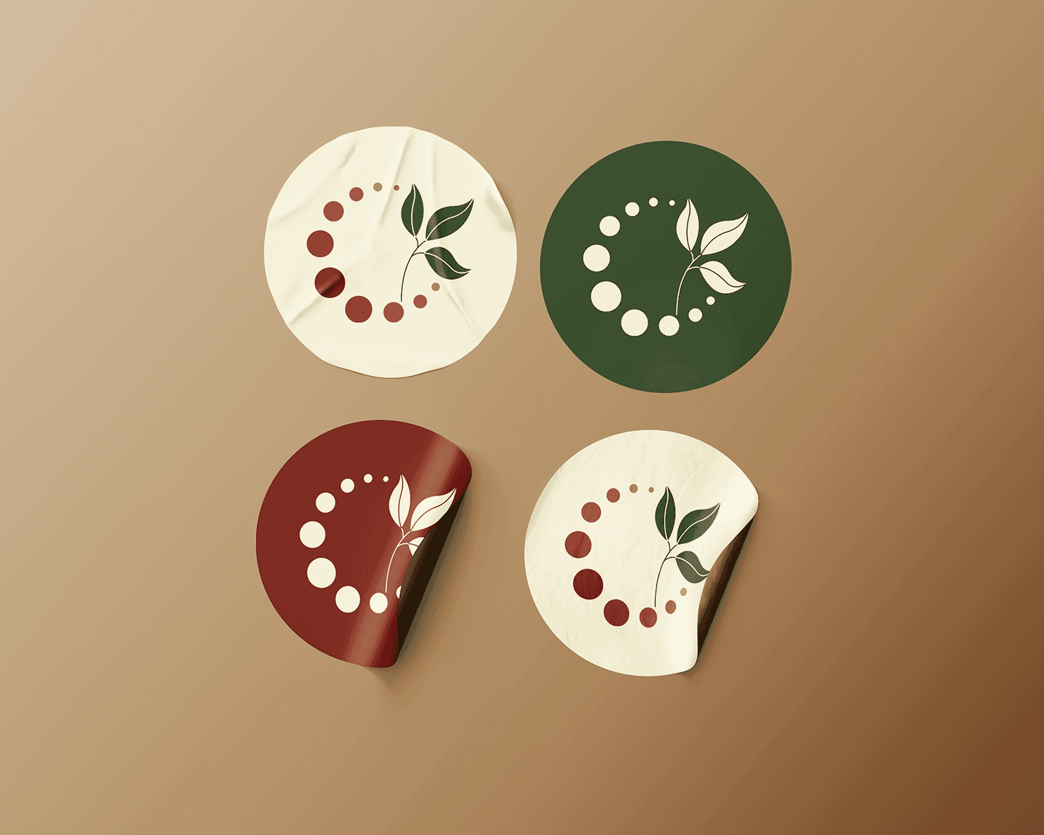
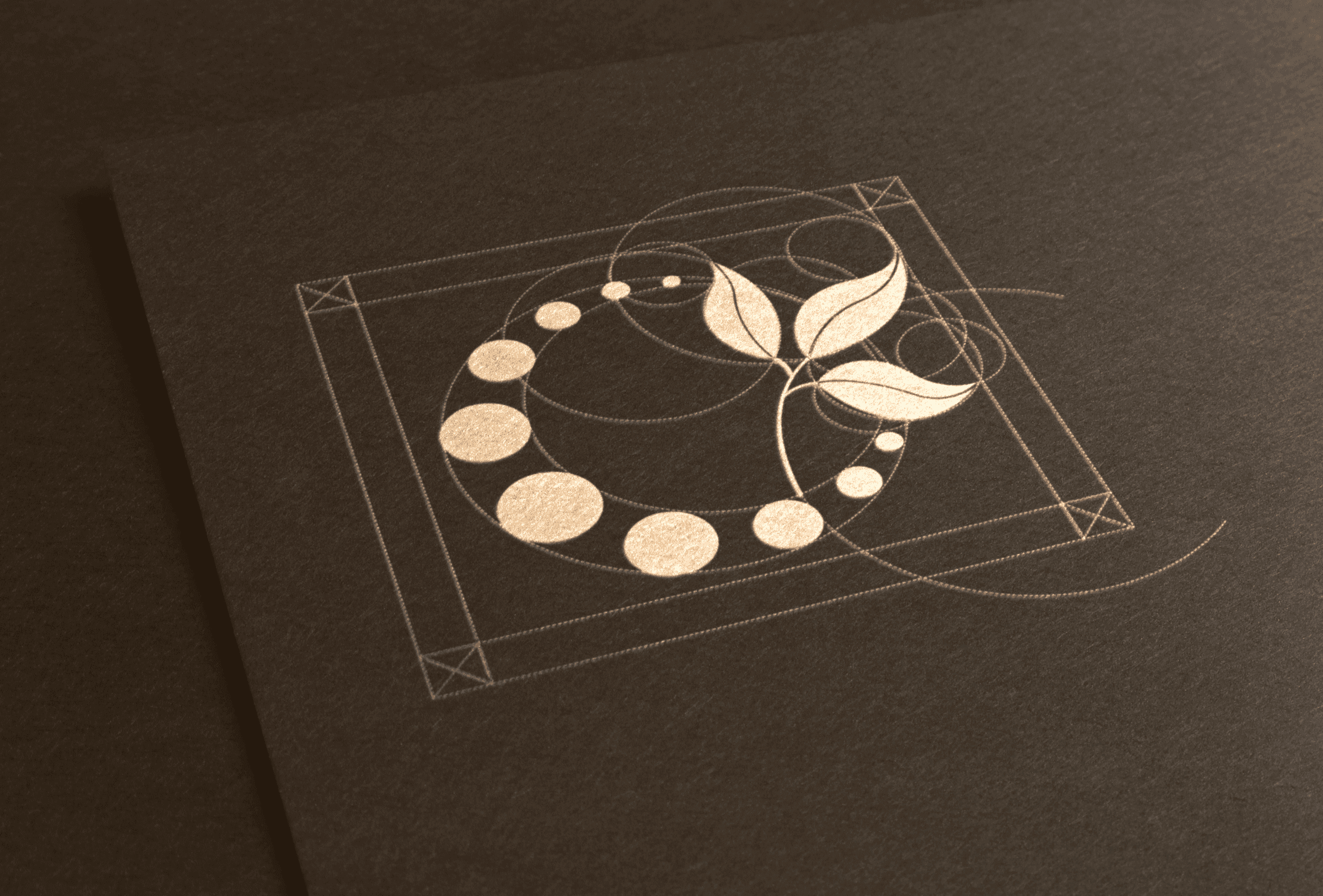
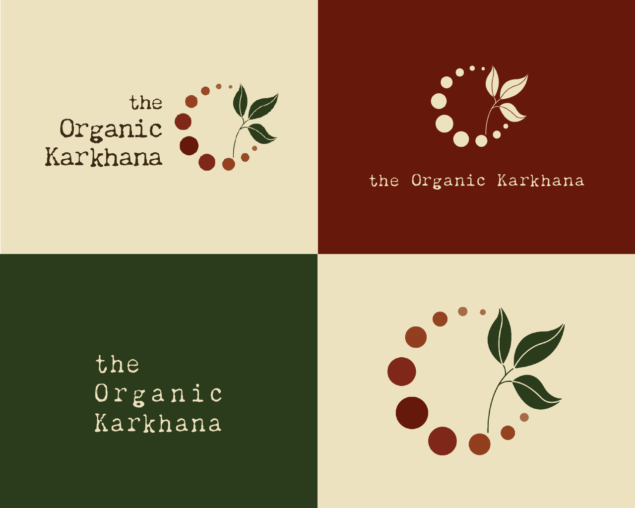
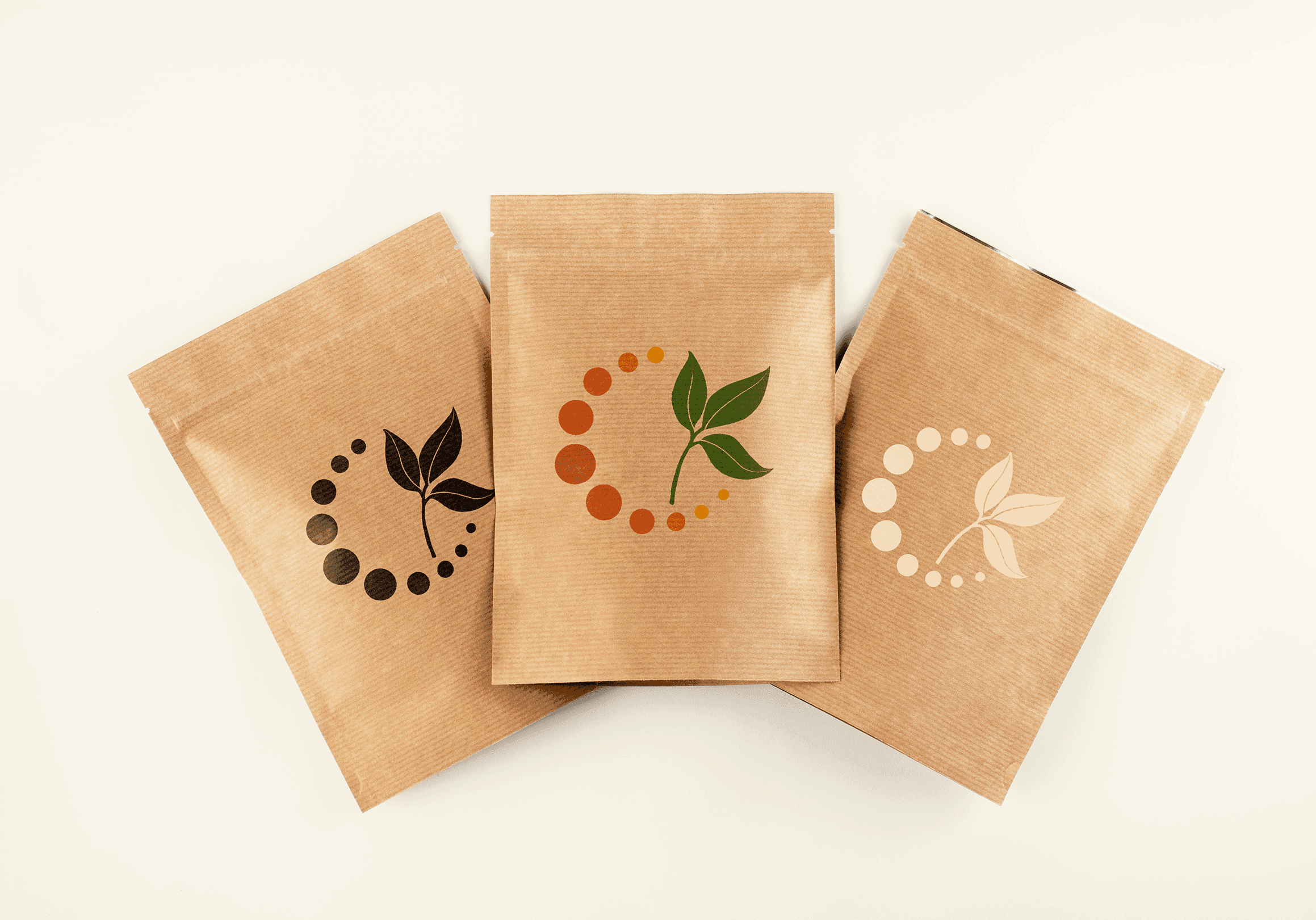
To build a strong Indian foundation, the logomark was drawn from the compartments of an Indian spice box combining with a curry leaf motif. The colour palette paired earthy tones with select vibrant accents for packaging. The inspiration for typography came from “Karkhana” - which means factory - highlighting the unpretentious rawness through a stencil-inspired type. For the packaging, a hand-illustrated mandala made of spices became the hero element being essentially Indian, with a nod to the spice box concept. An additional element to the packaging was a circular card/coaster, that stated the respective spice notes with an individual spice illustration.

problem

The Organic Karkhana was a spice brand to be pitched in the German market, a couple of years back. The brand needed to hold two competing ideas at once - feel authentically Indian to genuinely stand out, and reach a level of polish that could earn a shelf space in an unfamiliar, design-literate market. Avoiding any diluted or generic “ethnic” aesthetic that would turn out to be a repellent in the market.

solution

To build a strong Indian foundation, the logomark was drawn from the compartments of an Indian spice box combining with a curry leaf motif. The colour palette paired earthy tones with select vibrant accents for packaging. The inspiration for typography came from “Karkhana” - which means factory - highlighting the unpretentious rawness through a stencil-inspired type. For the packaging, a hand-illustrated mandala made of spices became the hero element being essentially Indian, with a nod to the spice box concept. An additional element to the packaging was a circular card/coaster, that stated the respective spice notes with an individual spice illustration.

problem

The Organic Karkhana was a spice brand to be pitched in the German market, a couple of years back. The brand needed to hold two competing ideas at once - feel authentically Indian to genuinely stand out, and reach a level of polish that could earn a shelf space in an unfamiliar, design-literate market. Avoiding any diluted or generic “ethnic” aesthetic that would turn out to be a repellent in the market.

solution

To build a strong Indian foundation, the logomark was drawn from the compartments of an Indian spice box combining with a curry leaf motif. The colour palette paired earthy tones with select vibrant accents for packaging. The inspiration for typography came from “Karkhana” - which means factory - highlighting the unpretentious rawness through a stencil-inspired type. For the packaging, a hand-illustrated mandala made of spices became the hero element being essentially Indian, with a nod to the spice box concept. An additional element to the packaging was a circular card/coaster, that stated the respective spice notes with an individual spice illustration.

problem

The Organic Karkhana was a spice brand to be pitched in the German market, a couple of years back. The brand needed to hold two competing ideas at once - feel authentically Indian to genuinely stand out, and reach a level of polish that could earn a shelf space in an unfamiliar, design-literate market. Avoiding any diluted or generic “ethnic” aesthetic that would turn out to be a repellent in the market.

solution

To build a strong Indian foundation, the logomark was drawn from the compartments of an Indian spice box combining with a curry leaf motif. The colour palette paired earthy tones with select vibrant accents for packaging. The inspiration for typography came from “Karkhana” - which means factory - highlighting the unpretentious rawness through a stencil-inspired type. For the packaging, a hand-illustrated mandala made of spices became the hero element being essentially Indian, with a nod to the spice box concept. An additional element to the packaging was a circular card/coaster, that stated the respective spice notes with an individual spice illustration.

Crafted, not manufactured - and built to be kept, not just used. Every hand-rendered element was a choice to keep the design feeling crafted rather than mass-produced. Given how exotic the spices themselves might be to a German audience, the packaging doubled as both a product guide and a keepsake. The project ultimately didn’t launch, but has been one of my favourites that I have worked on and learnt from.


year

2022

timeframe

2 Months

category

Packaging

01

.say hello

Always exited to work on a new project! Let's collaborate.

.say hello

Always exited to work on a new project! Let's collaborate.