Lingopanda

A mascot logo, brand identity, and ongoing graphic design system built around Lingopanda’s product revamp strategy.

00

problem

Lingopanda initially began with a bird mascot that was quite cluttered and unscalable. Changing it to a letter mascot was a solution for the time being. The branding had to be changed completely eventually, along with the mascot, working within an app that already had its own established product experience and presence. The new visual identity needed to be refined into something that could scale smoothly across various domains without hampering the existing user experience of the app.

solution

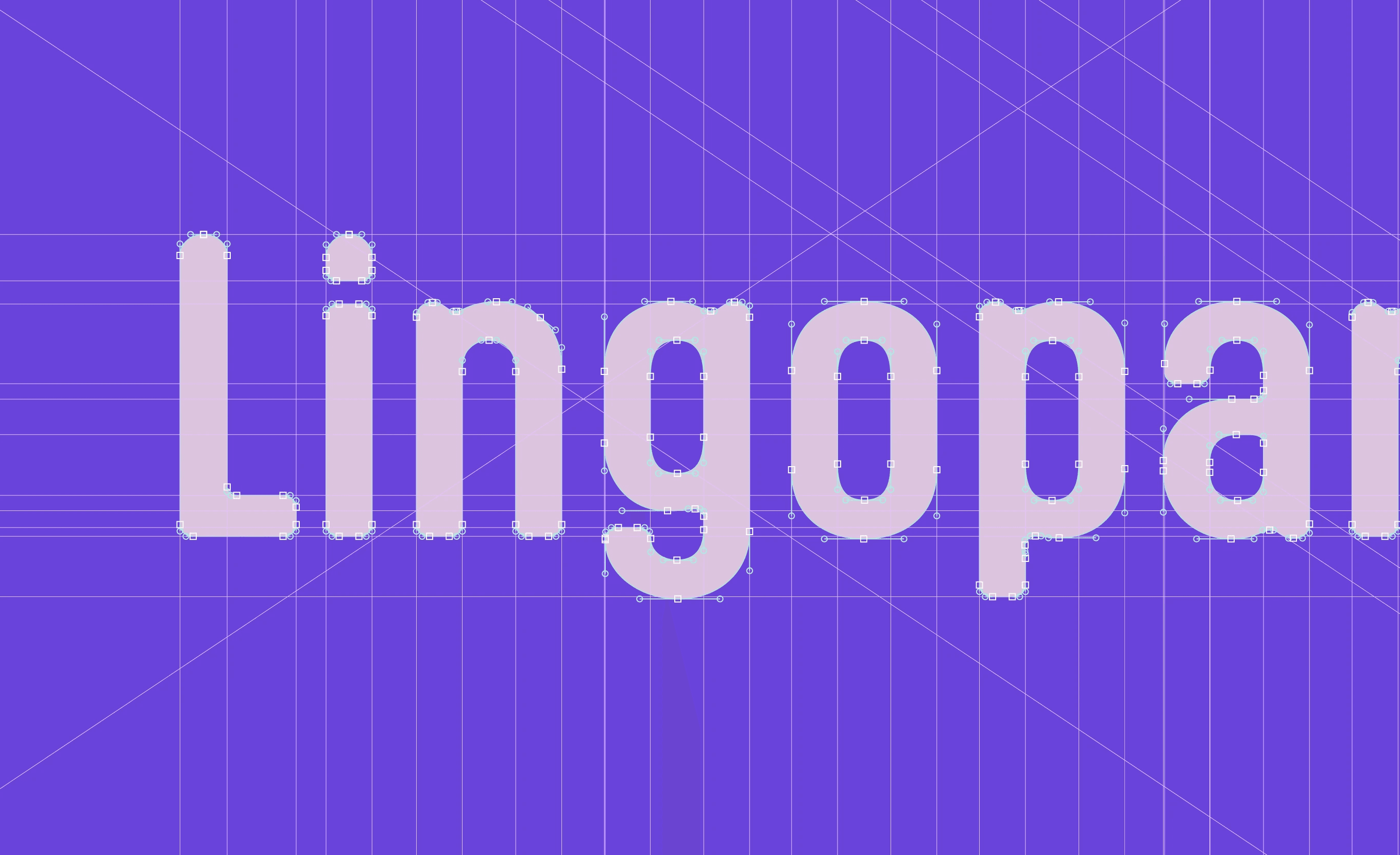
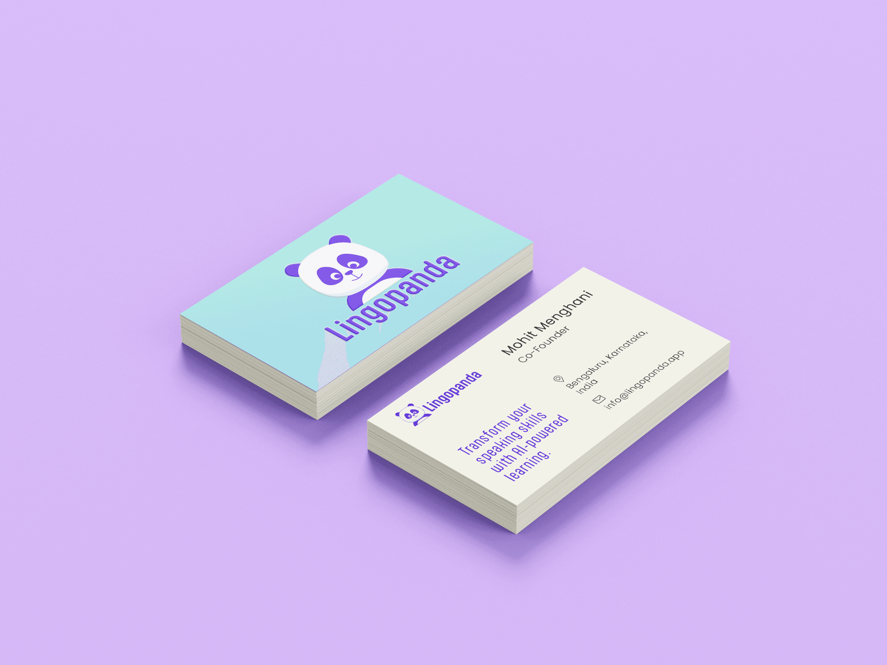
Character design and mascot development became the spine for the revamp. The panda’s personality had to be curated in a way that conveyed the brand values. For the visual identity, some tweaks to the existing colour palette had to be made and pair it with typography that reassured the “friendly” tone matching the set UI systems. Having a mascot allowed a personality intervention that could enhance the user experience lead by an alive, learning companion.

problem

Lingopanda initially began with a bird mascot that was quite cluttered and unscalable. Changing it to a letter mascot was a solution for the time being. The branding had to be changed completely eventually, along with the mascot, working within an app that already had its own established product experience and presence. The new visual identity needed to be refined into something that could scale smoothly across various domains without hampering the existing user experience of the app.

solution

Character design and mascot development became the spine for the revamp. The panda’s personality had to be curated in a way that conveyed the brand values. For the visual identity, some tweaks to the existing colour palette had to be made and pair it with typography that reassured the “friendly” tone matching the set UI systems. Having a mascot allowed a personality intervention that could enhance the user experience lead by an alive, learning companion.

problem

Lingopanda initially began with a bird mascot that was quite cluttered and unscalable. Changing it to a letter mascot was a solution for the time being. The branding had to be changed completely eventually, along with the mascot, working within an app that already had its own established product experience and presence. The new visual identity needed to be refined into something that could scale smoothly across various domains without hampering the existing user experience of the app.

solution

Character design and mascot development became the spine for the revamp. The panda’s personality had to be curated in a way that conveyed the brand values. For the visual identity, some tweaks to the existing colour palette had to be made and pair it with typography that reassured the “friendly” tone matching the set UI systems. Having a mascot allowed a personality intervention that could enhance the user experience lead by an alive, learning companion.

problem

Lingopanda initially began with a bird mascot that was quite cluttered and unscalable. Changing it to a letter mascot was a solution for the time being. The branding had to be changed completely eventually, along with the mascot, working within an app that already had its own established product experience and presence. The new visual identity needed to be refined into something that could scale smoothly across various domains without hampering the existing user experience of the app.

solution

Character design and mascot development became the spine for the revamp. The panda’s personality had to be curated in a way that conveyed the brand values. For the visual identity, some tweaks to the existing colour palette had to be made and pair it with typography that reassured the “friendly” tone matching the set UI systems. Having a mascot allowed a personality intervention that could enhance the user experience lead by an alive, learning companion.

A face makes a product easier to trust and easier to grow. Having a mascot for an app becomes one of the determining factors that makes a user click that install button. It also becomes a medium for a brand to grow across multiple domains, retaining the user base. The face-forward strategy opened a future scope of expansion, attracting new users and contributing to the app’s growth.


year

2024

timeframe

2.5 Years

category

Branding and Identity

01

02

03

04

05
06

07

08

09

010
011

012

013

014

015

016

.say hello

Always exited to work on a new project! Let's collaborate.

.say hello

Always exited to work on a new project! Let's collaborate.